This gallery shows how widgets and validations are rendered in both Studio and web environments, along with sample implementation code.
Widgets
Widgets allow to easily implement different types of input fields to your components.


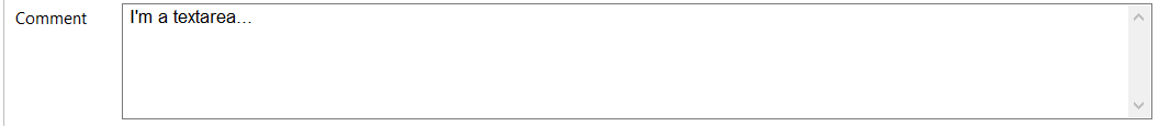
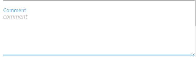


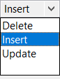
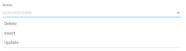
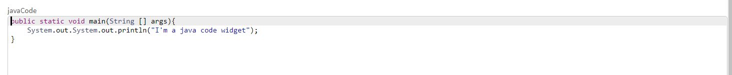
List
@Option
@Proposable("valuesProvider")
String config;
/** service class */
@DynamicValues("valuesProvider")
public Values actions(){
  return new Values(asList(new Values.Item("1", "Delete"),
                    new Values.Item("2", "Insert"),
                    new Values.Item("3", "Update")));
}
or
@Option
ActionEnum config;

/** Define enum */
enum ActionEnum {
    Delete,
    Insert,
    Update
}| Studio Rendering | Web Rendering |
|---|---|
|
|

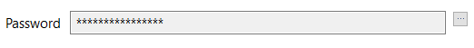
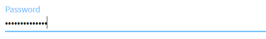
Validations
Validations help restricting what can be entered or selected in an input field, to make sure that the value complies with the expected type of information.
Property validation
/** configuration class */
@Option
@Validable("url")
String config;

/** service class */
@AsyncValidation("url")
ValidationResult doValidate(String url) {
//validate the property
}| Studio Rendering | Web Rendering |
|---|---|

|
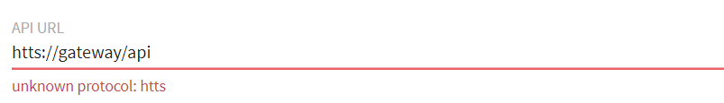
|
Property validation with Pattern
/** configuration class */
@Option
@Pattern("/^[a-zA-Z\\-]+$/")
String username;| Studio Rendering | Web Rendering |
|---|---|

|
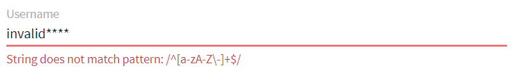
|
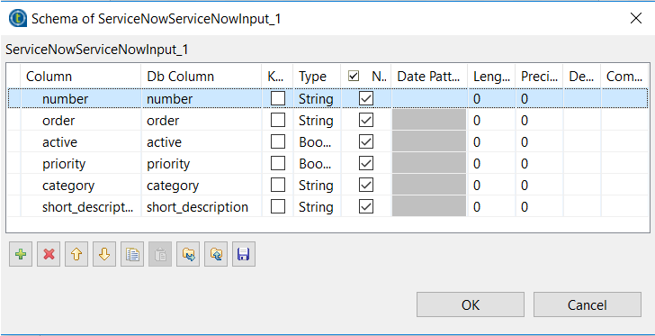
Data store validation
@Datastore
@Checkable
public class config {
/** config ...*/
}

/** service class */
@HealthCheck
public HealthCheckStatus testConnection(){

//validate the connection
}| Studio Rendering | Web Rendering |
|---|---|

|

|
You can also use other types of validation that are similar to @Pattern:
-
@Min,@Maxfor numbers. -
@Uniquefor collection values. -
@Requiredfor a required configuration.