This gallery shows how widgets and validations are rendered in both Studio and web environments, along with sample implementation code.
You can also find sample working components for each of the configuration cases below:
-
ActiveIf: Add visibility conditions on some configurations.
-
Checkbox: Add checkboxes or toggles to your component.
-
Code: Allow users to enter their own code.
-
Credential: Mark a configuration as sensitive data to avoid displaying it as plain text.
-
Datastore: Add a button allowing to check the connection to a datastore.
-
Datalist: Two ways of implementing a dropdown list with predefined choices.
-
Integer: Add numeric fields to your component configuration.
-
Min/Max: Specify a minimum or a maximum value for a numeric configuration.
-
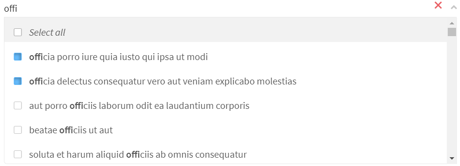
Multiselect: Add a list and allow users to select multiple elements of that list.
-
Pattern: Enforce rules based on a specific a pattern to prevent users from entering invalid values.
-
Required: Make a configuration mandatory.
-
Suggestions: Suggest possible values in a field based on what the users are entering.
-
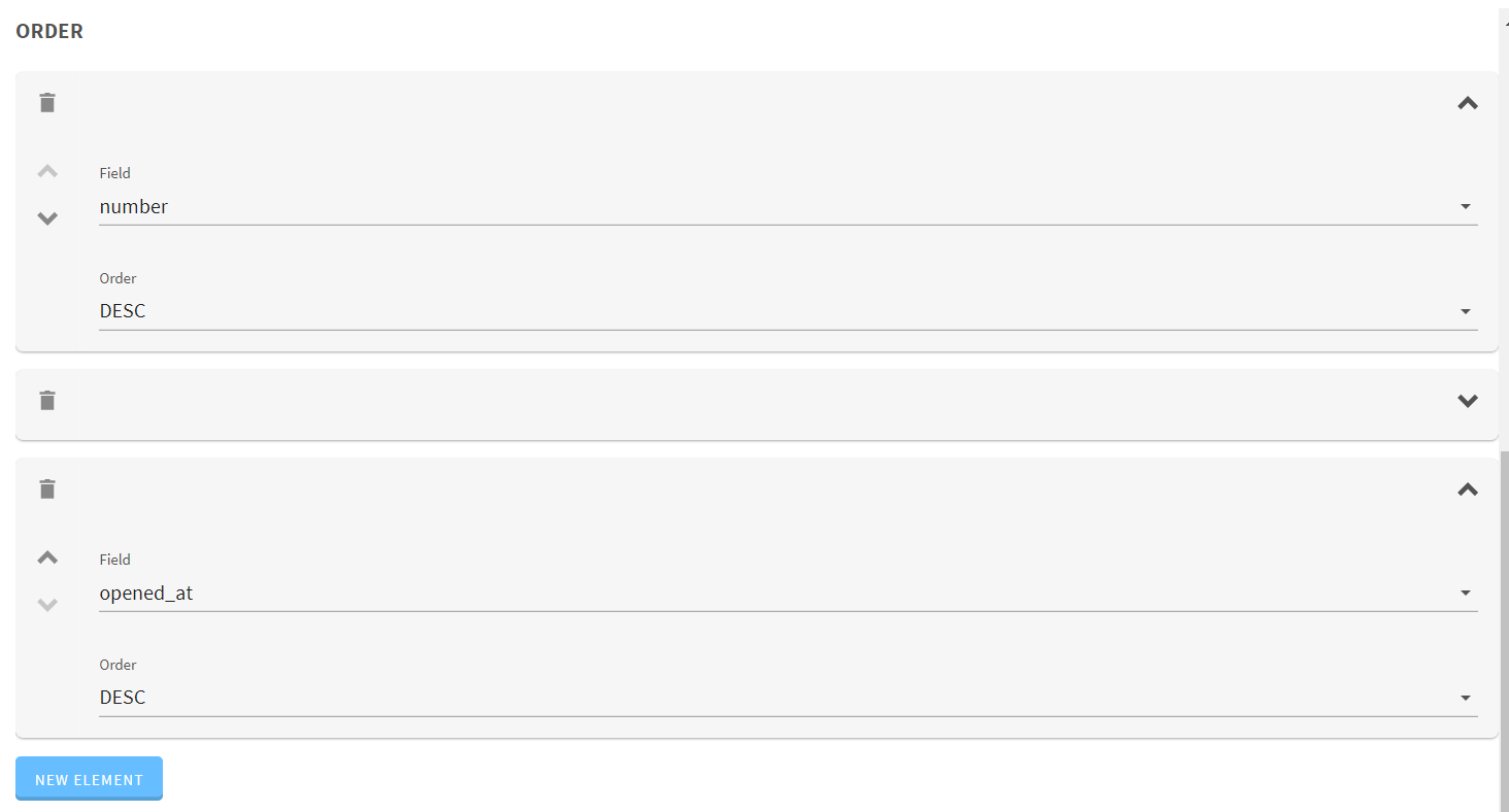
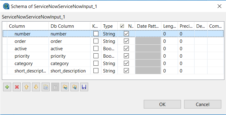
Table: Add a table to your component configuration.
-
Textarea: Add a text area for configurations expecting long texts or values.
-
Input: Add a simple text input field to the component configuration
-
Update: Provide a button allowing to fill a part of the component configuration based on a service.
-
Validation: Specify constraints to make sure that a URL is well formed.
Widgets
Widgets allow to easily implement different types of input fields to your components.
Integer
@Option
@Documentation("This is a number")
public Integer number;| Studio Rendering | Web Rendering |
|---|---|
Datetime
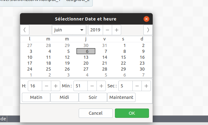
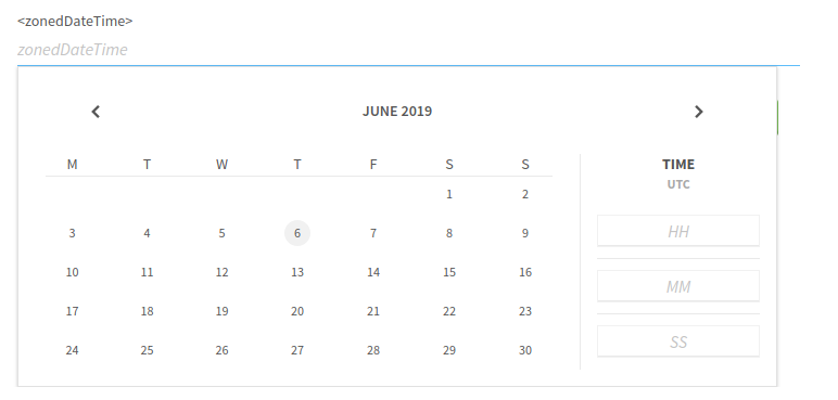
Datetime fields rely on the Java Date Time API, including LocalTime, LocalDate, LocalDateTime and ZonedDateTime classes.
@Option
LocalDateTime startTime;| Studio Rendering | Web Rendering |
|---|---|
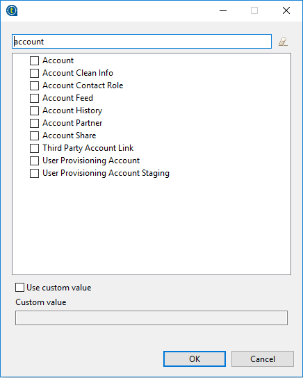
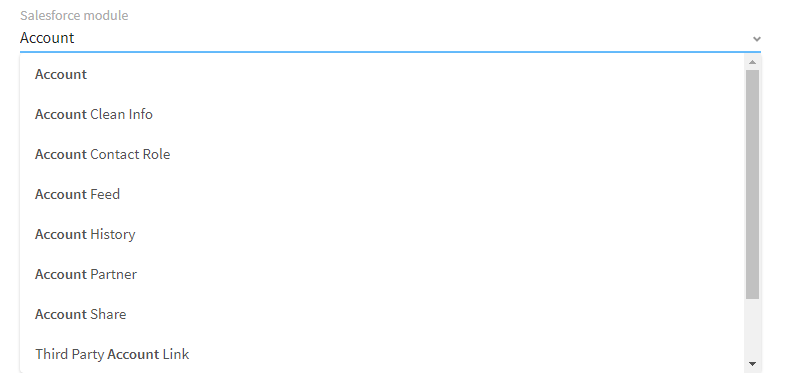
List
@Option
@Proposable("valuesProvider")
String config;
/** service class */
@DynamicValues("valuesProvider")
public Values actions(){
  return new Values(asList(new Values.Item("1", "Delete"),
                    new Values.Item("2", "Insert"),
                    new Values.Item("3", "Update")));
}
or
@Option
ActionEnum config;

/** Define enum */
enum ActionEnum {
    Delete,
    Insert,
    Update
}| Studio Rendering | Web Rendering |
|---|---|
Suggestions
@Option
@Suggestable(value = "loadModules", parameters = { "myconfig" })
@Documentation("module names are loaded using service")
public String moduleName;


// In Service class
@Suggestions("loadModules")
public SuggestionValues loadModules(@Option final MyConfig myconfig) { }| Studio Rendering | Web Rendering |
|---|---|
Validations
Validations help restricting what can be entered or selected in an input field, to make sure that the value complies with the expected type of information.
Property validation
/** configuration class */
@Option
@Validable("url")
String config;

/** service class */
@AsyncValidation("url")
ValidationResult doValidate(String url) {
//validate the property
}| Studio Rendering | Web Rendering |
|---|---|
Property validation with Pattern
/** configuration class */
@Option
@Pattern("/^[a-zA-Z\\-]+$/")
String username;| Studio Rendering | Web Rendering |
|---|---|
Data store validation
@Datastore
@Checkable
public class config {
/** config ...*/
}

/** service class */
@HealthCheck
public HealthCheckStatus testConnection(){

//validate the connection
}| Studio Rendering | Web Rendering |
|---|---|
You can also use other types of validation that are similar to @Pattern:
-
@Min,@Maxto specify a minimum and maximum value for numerical fields. -
@Uniquesfor collection values. -
@Requiredfor a required configuration.


