The component configuration is defined in the <component_name>Configuration.java file of the package. It consists in defining the configurable part of the component that will be displayed in the UI.
To do that, you can specify parameters. When you import the project in your IDE, the parameters that you have specified in the starter are already present.
| All input and output components must reference a dataset in their configuration. Refer to Defining datasets and datastores. |
Parameter name
Components are configured using their constructor parameters. All parameters can be marked with the @Option property, which lets you give a name to them.
For the name to be correct, you must follow these guidelines:
-
Use a valid Java name.
-
Do not include any
.character in it. -
Do not start the name with a
$. -
Defining a name is optional. If you don’t set a specific name, it defaults to the bytecode name. This can require you to compile with a
-parameterflag to avoid ending up with names such as arg0, arg1, and so on.
Examples of option name:
| Option name | Valid |
|---|---|
myName |
|
my_name |
|
my.name |
|
$myName |
Parameter types
Parameter types can be primitives or complex objects with fields decorated with @Option exactly like method parameters.
| It is recommended to use simple models which can be serialized in order to ease serialized component implementations. |
For example:
class FileFormat implements Serializable {
    @Option("type")
    private FileType type = FileType.CSV;

    @Option("max-records")
    private int maxRecords = 1024;
}

@PartitionMapper(name = "file-reader")
public MyFileReader(@Option("file-path") final File file,
                    @Option("file-format") final FileFormat format) {
    // ...
}
Using this kind of API makes the configuration extensible and component-oriented, which allows you to define all you need.
The instantiation of the parameters is done from the properties passed to the component.
Primitives
A primitive is a class which can be directly converted from a String to the expected type.
It includes all Java primitives, like the String type itself, but also all types with a org.apache.xbean.propertyeditor.Converter:
-
BigDecimal -
BigInteger -
File -
InetAddress -
ObjectName -
URI -
URL -
Pattern -
LocalDateTime -
ZonedDateTime
Mapping complex objects
The conversion from property to object uses the Dot notation.
For example, assuming the method parameter was configured with @Option("file"):
file.path = /home/user/input.csv
file.format = CSV
matches
public class FileOptions {
    @Option("path")
    private File path;

    @Option("format")
    private Format format;
}
List case
Lists rely on an indexed syntax to define their elements.
For example, assuming that the list parameter is named files and that the elements are of the FileOptions type, you can define a list of two elements as follows:
files[0].path = /home/user/input1.csv
files[0].format = CSV
files[1].path = /home/user/input2.xml
files[1].format = EXCEL
if you desire to override a config to truncate an array, use the index length, for example to truncate previous example to only CSV, you can set:
|
files[length] = 1Map case
Similarly to the list case, the map uses .key[index] and .value[index] to represent its keys and values:
// Map<String, FileOptions>
files.key[0] = first-file
files.value[0].path = /home/user/input1.csv
files.value[0].type = CSV
files.key[1] = second-file
files.value[1].path = /home/user/input2.xml
files.value[1].type = EXCEL
// Map<FileOptions, String>
files.key[0].path = /home/user/input1.csv
files.key[0].type = CSV
files.value[0] = first-file
files.key[1].path = /home/user/input2.xml
files.key[1].type = EXCEL
files.value[1] = second-file| Avoid using the Map type. Instead, prefer configuring your component with an object if this is possible. |
Defining Constraints and validations on the configuration
You can use metadata to specify that a field is required or has a minimum size, and so on. This is done using the validation metadata in the org.talend.sdk.component.api.configuration.constraint package:
MaxLength
Ensure the decorated option size is validated with a higher bound.
-
API:
@org.talend.sdk.component.api.configuration.constraint.Max -
Name:
maxLength -
Parameter Type:
double -
Supported Types: —
java.lang.CharSequence -
Sample:
{
  "validation::maxLength":"12.34"
}
MinLength
Ensure the decorated option size is validated with a lower bound.
-
API:
@org.talend.sdk.component.api.configuration.constraint.Min -
Name:
minLength -
Parameter Type:
double -
Supported Types: —
java.lang.CharSequence -
Sample:
{
  "validation::minLength":"12.34"
}
Pattern
Validate the decorated string with a javascript pattern (even into the Studio).
-
API:
@org.talend.sdk.component.api.configuration.constraint.Pattern -
Name:
pattern -
Parameter Type:
java.lang.string -
Supported Types: —
java.lang.CharSequence -
Sample:
{
  "validation::pattern":"test"
}
Max
Ensure the decorated option size is validated with a higher bound.
-
API:
@org.talend.sdk.component.api.configuration.constraint.Max -
Name:
max -
Parameter Type:
double -
Supported Types: —
java.lang.Number—int—short—byte—long—double—float -
Sample:
{
  "validation::max":"12.34"
}
Min
Ensure the decorated option size is validated with a lower bound.
-
API:
@org.talend.sdk.component.api.configuration.constraint.Min -
Name:
min -
Parameter Type:
double -
Supported Types: —
java.lang.Number—int—short—byte—long—double—float -
Sample:
{
  "validation::min":"12.34"
}
Required
Mark the field as being mandatory.
-
API:
@org.talend.sdk.component.api.configuration.constraint.Required -
Name:
required -
Parameter Type:
- -
Supported Types: —
java.lang.Object -
Sample:
{
  "validation::required":"true"
}
MaxItems
Ensure the decorated option size is validated with a higher bound.
-
API:
@org.talend.sdk.component.api.configuration.constraint.Max -
Name:
maxItems -
Parameter Type:
double -
Supported Types: —
java.util.Collection -
Sample:
{
  "validation::maxItems":"12.34"
}
MinItems
Ensure the decorated option size is validated with a lower bound.
-
API:
@org.talend.sdk.component.api.configuration.constraint.Min -
Name:
minItems -
Parameter Type:
double -
Supported Types: —
java.util.Collection -
Sample:
{
  "validation::minItems":"12.34"
}
UniqueItems
Ensure the elements of the collection must be distinct (kind of set).
-
API:
@org.talend.sdk.component.api.configuration.constraint.Uniques -
Name:
uniqueItems -
Parameter Type:
- -
Supported Types: —
java.util.Collection -
Sample:
{
  "validation::uniqueItems":"true"
}
When using the programmatic API, metadata is prefixed by tcomp::. This prefix is stripped in the web for convenience, and the table above uses the web keys.
|
Also note that these validations are executed before the runtime is started (when loading the component instance) and that the execution will fail if they don’t pass.
If it breaks your application, you can disable that validation on the JVM by setting the system property talend.component.configuration.validation.skip to true.
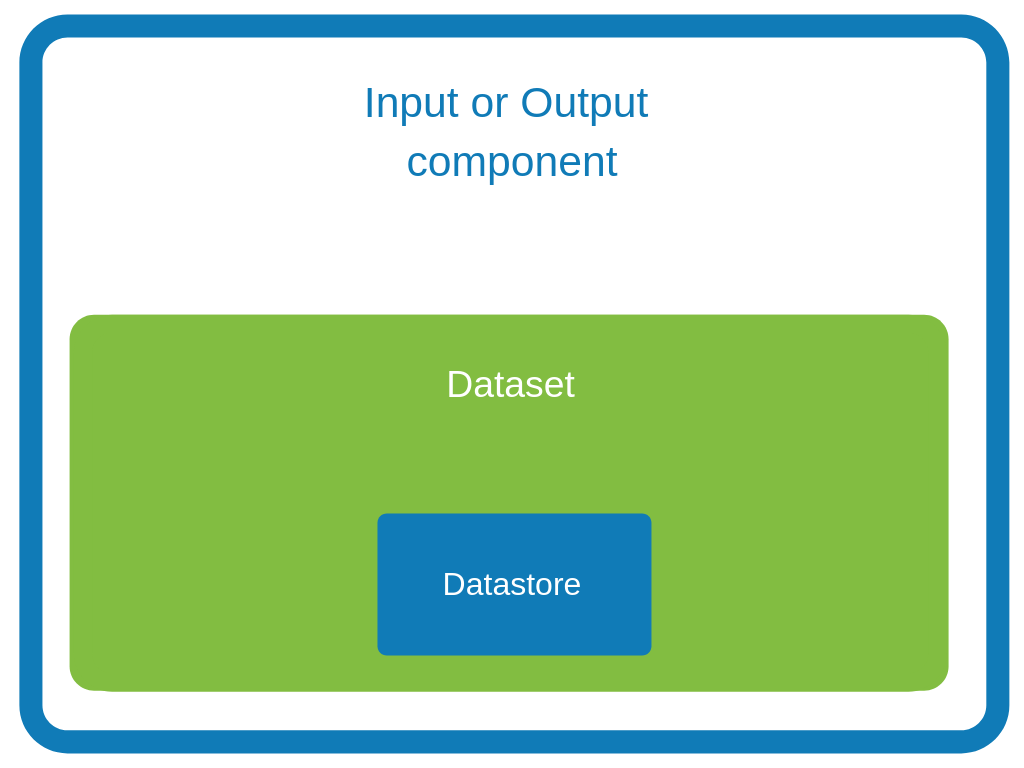
Defining datasets and datastores
Datasets and datastores are configuration types that define how and where to pull the data from. They are used at design time to create shared configurations that can be stored and used at runtime.
All connectors (input and output components) created using Talend Component Kit must reference a valid dataset. Each dataset must reference a datastore.
-
Datastore: The data you need to connect to the backend.
-
Dataset: A datastore coupled with the data you need to execute an action.
|
Make sure that:
These rules are enforced by the |
Defining a datastore
A datastore defines the information required to connect to a data source. For example, it can be made of:
-
a URL
-
a username
-
a password.
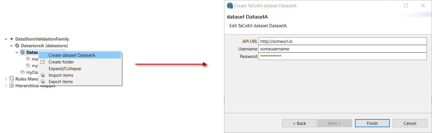
You can specify a datastore and its context of use (in which dataset, etc.) from the Component Kit Starter.
| Make sure to modelize the data your components are designed to handle before defining datasets and datastores in the Component Kit Starter. |
Once you generate and import the project into an IDE, you can find datastores under a specific datastore node.

Example of datastore:
package com.mycomponent.components.datastore;

@DataStore("DatastoreA") (1)
@GridLayout({ (2)
    // The generated component layout will display one configuration entry per line.
    // Customize it as much as needed.
    @GridLayout.Row({ "apiurl" }),
    @GridLayout.Row({ "username" }),
    @GridLayout.Row({ "password" })
})
@Documentation("A Datastore made of an API URL, a username, and a password. The password is marked as Credential.") (3)
public class DatastoreA implements Serializable {
    @Option
    @Documentation("")
    private String apiurl;

    @Option
    @Documentation("")
    private String username;

    @Option
    @Credential
    @Documentation("")
    private String password;

    public String getApiurl() {
        return apiurl;
    }

    public DatastoreA setApiurl(String apiurl) {
        this.apiurl = apiurl;
        return this;
    }

    public String getUsername() {
        return Username;
    }

    public DatastoreA setuUsername(String username) {
        this.username = username;
        return this;
    }

    public String getPassword() {
        return password;
    }

    public DatastoreA setPassword(String password) {
        this.password = password;
        return this;
    }
}| 1 | Identifying the class as a datastore and naming it. |
| 2 | Defining the layout of the datastore configuration. |
| 3 | Defining each element of the configuration: a URL, a username, and a password. Note that the password is also marked as a credential. |
Defining a dataset
A dataset represents the inbound data. It is generally made of:
-
A datastore that defines the connection information needed to access the data.
-
A query.
You can specify a dataset and its context of use (in which input and output component it is used) from the Component Kit Starter.
| Make sure to modelize the data your components are designed to handle before defining datasets and datastores in the Component Kit Starter. |
Once you generate and import the project into an IDE, you can find datasets under a specific dataset node.
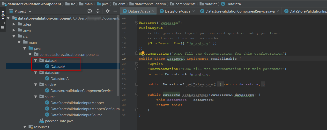
Example of dataset referencing the datastore shown above:
package com.datastorevalidation.components.dataset;

@DataSet("DatasetA") (1)
@GridLayout({
    // The generated component layout will display one configuration entry per line.
    // Customize it as much as needed.
    @GridLayout.Row({ "datastore" })
})
@Documentation("A Dataset configuration containing a simple datastore") (2)
public class DatasetA implements Serializable {
    @Option
    @Documentation("Datastore")
    private DatastoreA datastore;

    public DatastoreA getDatastore() {
        return datastore;
    }

    public DatasetA setDatastore(DatastoreA datastore) {
        this.datastore = datastore;
        return this;
    }
}| 1 | Identifying the class as a dataset and naming it. |
| 2 | Implementing the dataset and referencing DatastoreA as the datastore to use. |
Internationalizing datasets and datastores
The display name of each dataset and datastore must be referenced in the message.properties file of the family package.
The key for dataset and datastore display names follows a defined pattern: ${family}.${configurationType}.${name}._displayName. For example:
ComponentFamily.dataset.DatasetA._displayName=Dataset A
ComponentFamily.datastore.DatastoreA._displayName=Datastore A
These keys are automatically added for datasets and datastores defined from the Component Kit Starter.
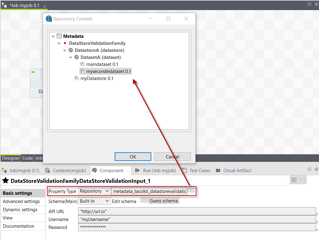
Reusing datasets and datastores in Talend Studio
When deploying a component or set of components that include datasets and datastores to Talend Studio, a new node is created under Metadata. This node has the name of the component family that was deployed.
It allows users to create reusable configurations for datastores and datasets.
With predefined datasets and datastores, users can then quickly fill the component configuration in their jobs. They can do so by selecting Repository as Property Type and by browsing to the predefined dataset or datastore.
How to create a reusable connection in Studio
Studio will generate connection and close components auto for reusing connection function in input and output components, just need to do like this example:
@Service
public class SomeService {

    @CreateConnection
    public Object createConn(@Option("configuration") SomeDataStore dataStore) throws ComponentException {
        Object connection = null;
        //get conn object by dataStore
        return conn;
    }

    @CloseConnection
    public CloseConnectionObject closeConn() {
        return new CloseConnectionObject() {

            public boolean close() throws ComponentException {
                Object connection = this.getConnection();
                //do close action
                return true;
            }

        };
    }
}
Then the runtime mapper and processor only need to use @Connection to get the connection like this:
@Version(1)
@Icon(value = Icon.IconType.CUSTOM, custom = "SomeInput")
@PartitionMapper(name = "SomeInput")
@Documentation("the doc")
public class SomeInputMapper implements Serializable {

    @Connection
    SomeConnection conn;

}
How does the component server interact with datasets and datastores
The component server scans all configuration types and returns a configuration type index. This index can be used for the integration into the targeted platforms (Studio, web applications, and so on).
Dataset
Mark a model (complex object) as being a dataset.
-
API: @org.talend.sdk.component.api.configuration.type.DataSet
-
Sample:
{
  "tcomp::configurationtype::name":"test",
  "tcomp::configurationtype::type":"dataset"
}
Datastore
Mark a model (complex object) as being a datastore (connection to a backend).
-
API: @org.talend.sdk.component.api.configuration.type.DataStore
-
Sample:
{
  "tcomp::configurationtype::name":"test",
  "tcomp::configurationtype::type":"datastore"
}
DatasetDiscovery
Mark a model (complex object) as being a dataset discovery configuration.
-
API: @org.talend.sdk.component.api.configuration.type.DatasetDiscovery
-
Sample:
{
  "tcomp::configurationtype::name":"test",
  "tcomp::configurationtype::type":"datasetDiscovery"
}| The component family associated with a configuration type (datastore/dataset) is always the one related to the component using that configuration. |
The configuration type index is represented as a flat tree that contains all the configuration types, which themselves are represented as nodes and indexed by ID.
Every node can point to other nodes. This relation is represented as an array of edges that provides the child IDs.
As an illustration, a configuration type index for the example above can be defined as follows:
{nodes: {
             "idForDstore": { datastore:"datastore data", edges:[id:"idForDset"] },
             "idForDset":   { dataset:"dataset data" }
    }
}
Defining links between properties
If you need to define a binding between properties, you can use a set of annotations:
ActiveIf
If the evaluation of the element at the location matches value then the element is considered active, otherwise it is deactivated.
-
API:
@org.talend.sdk.component.api.configuration.condition.ActiveIf -
Type:
if -
Sample:
{
  "condition::if::evaluationStrategy":"DEFAULT",
  "condition::if::negate":"false",
  "condition::if::target":"test",
  "condition::if::value":"value1,value2"
}
ActiveIfs
Allows to set multiple visibility conditions on the same property.
-
API:
@org.talend.sdk.component.api.configuration.condition.ActiveIfs -
Type:
ifs -
Sample:
{
  "condition::if::evaluationStrategy::0":"DEFAULT",
  "condition::if::evaluationStrategy::1":"LENGTH",
  "condition::if::negate::0":"false",
  "condition::if::negate::1":"true",
  "condition::if::target::0":"sibling1",
  "condition::if::target::1":"../../other",
  "condition::if::value::0":"value1,value2",
  "condition::if::value::1":"SELECTED",
  "condition::ifs::operator":"AND"
}
Where:
-
target is the element to evaluate.
-
value is the value to compare against.
-
strategy (optional) is the evaluation criteria. Possible values are:
-
CONTAINS: Checks if a string or list of strings contains the defined value. -
DEFAULT: Compares against the raw value. -
LENGTH: For an array or string, evaluates the size of the value instead of the value itself.
-
-
negate (optional) defines if the test must be positive (default, set to
false) or negative (set totrue). -
operator (optional) is the comparison operator used to combine several conditions, if applicable. Possible values are
ANDandOR.
The target element location is specified as a relative path to the current location, using Unix path characters.
The configuration class delimiter is /.
The parent configuration class is specified by ...
Thus, ../targetProperty denotes a property, which is located in the parent configuration class and is named targetProperty.
When using the programmatic API, metadata is prefixed with tcomp::. This prefix is stripped in the web for convenience, and the previous table uses the web keys.
|
For more details, refer to the related Javadocs.
ActiveIf examples
Example 1
A common use of the ActiveIf condition consists in testing if a target property has a value. To do that, it is possible to test if the length of the property value is different from 0:
-
target:
foo- the path to the property to evaluate. -
strategy:
LENGTH- the strategy consists here in testing the length of the property value. -
value:
0- the length of the property value is compared to0. -
negate:
true- setting negate totruemeans that the strategy of the target must be different from the value defined. In this case, theLENGTHof the value of thefooproperty must be different from0.
{
  "condition::if::target": "foo",
  "condition::if::value": "0",
  "condition::if::negate": "true",
  "condition::if::evaluationStrategy": "LENGTH",
}
Example 2
The following example shows how to implement visibility conditions on several fields based on several checkbox configurations:
-
If the first checkbox is selected, an additional input field is displayed.
-
if the second or the third checkbox is selected, an additional input field is displayed.
-
if both second and third checkboxes are selected, an additional input field is displayed.
@GridLayout({
    // the generated layout put one configuration entry per line,
    // customize it as much as needed
    @GridLayout.Row({ "checkbox1" }),
    @GridLayout.Row({ "checkbox2" }),
    @GridLayout.Row({ "checkbox3" }),
    @GridLayout.Row({ "configuration4" }),
    @GridLayout.Row({ "configuration5" }),
    @GridLayout.Row({ "configuration6" })
})
@Documentation("A sample configuration with different visibility condition cases")
public class ActiveifProcessorProcessorConfiguration implements Serializable {
    @Option
    @Documentation("")
    private boolean checkbox1;

    @Option
    @Documentation("")
    private boolean checkbox2;

    @Option
    @Documentation("")
    private boolean checkbox3;

    @Option
    @ActiveIf(target = "checkbox1", value = "true")
    @Documentation("Active if checkbox1 is selected")
    private String configuration4;

    @Option
    @ActiveIfs(operator = ActiveIfs.Operator.OR, value = {
            @ActiveIf(target = "checkbox2", value = "true"),
            @ActiveIf(target = "checkbox3", value = "true")
    })
    @Documentation("Active if checkbox2 or checkbox 3 are selected")
    private String configuration5;

    @Option
    @ActiveIfs(operator = ActiveIfs.Operator.AND, value = {
            @ActiveIf(target = "checkbox2", value = "true"),
            @ActiveIf(target = "checkbox3", value = "true")
    })
    @Documentation("Active if checkbox2 and checkbox 3 are selected")
    private String configuration6;
  }
Adding hints about the rendering
In some cases, you may need to add metadata about the configuration to let the UI render that configuration properly.
For example, a password value that must be hidden and not a simple clear input box. For these cases - if you want to change the UI rendering - you can use a particular set of annotations:
@DefaultValue
Provide a default value the UI can use - only for primitive fields.
-
API:
@org.talend.sdk.component.api.configuration.ui.DefaultValue
@OptionsOrder
Allows to sort a class properties.
-
API:
@org.talend.sdk.component.api.configuration.ui.OptionsOrder
@AutoLayout
Request the rendered to do what it thinks is best.
-
API:
@org.talend.sdk.component.api.configuration.ui.layout.AutoLayout
@GridLayout
Advanced layout to place properties by row, this is exclusive with @OptionsOrder.
the logic to handle forms (gridlayout names) is to use the only layout if there is only one defined, else to check if there are Main and Advanced and if at least Main exists, use them, else use all available layouts.
|
-
API:
@org.talend.sdk.component.api.configuration.ui.layout.GridLayout
@GridLayouts
Allow to configure multiple grid layouts on the same class, qualified with a classifier (name)
-
API:
@org.talend.sdk.component.api.configuration.ui.layout.GridLayouts
@HorizontalLayout
Put on a configuration class it notifies the UI an horizontal layout is preferred.
-
API:
@org.talend.sdk.component.api.configuration.ui.layout.HorizontalLayout
@VerticalLayout
Put on a configuration class it notifies the UI a vertical layout is preferred.
-
API:
@org.talend.sdk.component.api.configuration.ui.layout.VerticalLayout
@Code
Mark a field as being represented by some code widget (vs textarea for instance).
-
API:
@org.talend.sdk.component.api.configuration.ui.widget.Code
@Credential
Mark a field as being a credential. It is typically used to hide the value in the UI.
-
API:
@org.talend.sdk.component.api.configuration.ui.widget.Credential
@DateTime
Mark a field as being a date. It supports and is implicit - which means you don’t need to put that annotation on the option - for java.time.ZonedDateTime, java.time.LocalDate and java.time.LocalDateTime and is unspecified for other types.
-
API:
@org.talend.sdk.component.api.configuration.ui.widget.DateTime
@ModuleList
Mark a string field as being represented by selected module list widget, only for studio
-
API:
@org.talend.sdk.component.api.configuration.ui.widget.ModuleList
@Structure
Mark a List<String> or List<Object> field as being represented as the component data selector.
-
API:
@org.talend.sdk.component.api.configuration.ui.widget.Structure
@TextArea
Mark a field as being represented by a textarea(multiline text input).
-
API:
@org.talend.sdk.component.api.configuration.ui.widget.TextArea
Snippets
{
  "ui::textarea":"true"
}
When using the programmatic API, metadata is prefixed with tcomp::. This prefix is stripped in the web for convenience, and the previous table uses the web keys.
|
You can also check this example about masking credentials.
Target support should cover org.talend.core.model.process.EParameterFieldType but you need to ensure that the web renderer is able to handle the same widgets.
Implementation samples
You can find sample working components for each of the configuration cases below:
-
ActiveIf: Add visibility conditions on some configurations.
-
Checkbox: Add checkboxes or toggles to your component.
-
Code: Allow users to enter their own code.
-
Credential: Mark a configuration as sensitive data to avoid displaying it as plain text.
-
Datastore: Add a button allowing to check the connection to a datastore.
-
Datalist: Two ways of implementing a dropdown list with predefined choices.
-
Integer: Add numeric fields to your component configuration.
-
Min/Max: Specify a minimum or a maximum value for a numeric configuration.
-
Multiselect: Add a list and allow users to select multiple elements of that list.
-
Pattern: Enforce rules based on a specific a pattern to prevent users from entering invalid values.
-
Required: Make a configuration mandatory.
-
Suggestions: Suggest possible values in a field based on what the users are entering.
-
Table: Add a table to your component configuration.
-
Textarea: Add a text area for configurations expecting long texts or values.
-
Input: Add a simple text input field to the component configuration
-
Update: Provide a button allowing to fill a part of the component configuration based on a service.
-
Validation: Specify constraints to make sure that a URL is well formed.